

MongoDB Charts (Beta)
After being briefly introduced to MongoDB Charts (Beta) at MongoDB.Local in San Francisco last month, diving into MongoDB Charts has been on my list of things to do in the new year. Lucky for me, there was a free webinar hosted yesterday by Jane Fine and MongoDB where she so eloquently showcased how easy it can be to visualize your data with Charts.
What I learned
Some Benefits of using Charts:
* Visualize your data without needing to write your own code (makes your life easier!)

* You can test out Charts via the MongoDB Atlas free tier (set up of cluster required)

* It's the fasted way to build visualizations of your MongoDB data

* It's fully integrated with MongoDB Atlas
The basic concepts:
* Data Source => reference to a MongoDB collection or view that contains data

* Chart => a visualization of data

* Dashboard => collection of charts
After watching the webinar I decided to spin up a couple of test charts on my MongoDB Cluster. The steps below are what I used to get started with MongoDB Charts:
* Mongo Atlas Cluster UI => Charts => Activate => New Data Source (ie., your database) => Choose Collection => Set Permissions ( to read only for users )
Once your data source has been chosen, Charts becomes autopopulated with your chosen collection.
After creating your new Data Source, go to the Dashboards tab => New Dashboard and give your new project a title.
Proceed to the Add Charts tab to begin building your dashboard by adding your first chart:
* Enter a title for your chart (via pencil icon @ top of UI)

* Choose a *Chart Type* from the provided dropdown
Choose a Data Source to begin building your chart (ie., via the Data Source tab in top left corner of the Charts UI) and a chart type (in this case I'm using a bar chart), then proceed as follows:
      * Drag fields from the list on the left to the encoding channels

      * X Axis => aggregation, Y Axix => + category, Series + category
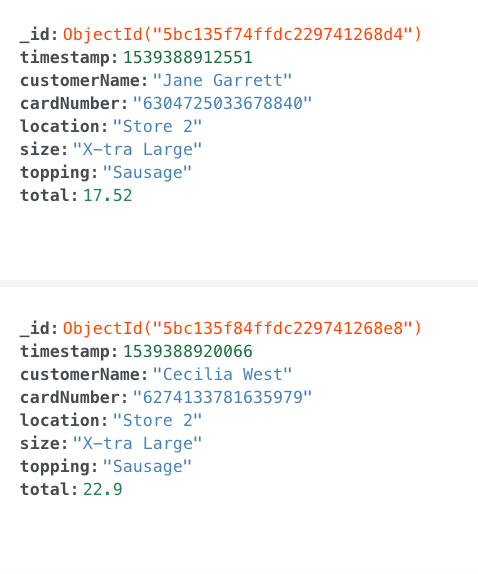
To get started, I used a sample database with a receipts collection that holds the data on 3 separate Pizza shops. My goal was to to see what ingredients/toppings were the most popular with customers by store.
Here is an example of what the schema looks like:
With the default bar chart selected, I assigned the field total to the X-Axis, the field topping to the Y-Axis, and the field location to the Series tab. The resulting chart can be seen below:
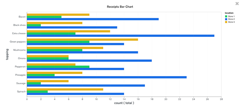
From this chart it is easy to conclude that extra cheese is one of the most popular pizza toppings in this dataset.
The second chart that I created comes from a free/open-sourced dataset from Kaggle.
The details of this dataset are:
        * Wine Reviews
        * 130k wine reviews with variety, location, winery, price, and  description
        * Points => The number of points rated by wine enthusiasts with a scale of 1-100
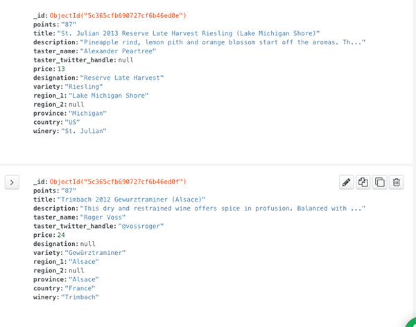
Here is an example of what the schema looks like:
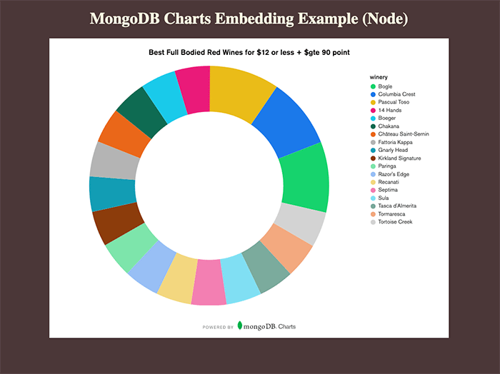
Being a red wine enthusiast on a budget, I set out to find the highest rated winery brands with a rating of at least 90, costing no more than $12 per bottle.
I utilized the filter function provided by the Charts UI to filter by some of my favorite wine varieties. I also filtered on the price:
{ variety: { $in: [ "Cabernet", "Syrah", "Shiraz", "Malbec", "Red Blend", "Zinfandel" ] }, 'price': {$lte: 12}, 'points': {$gte: "90"} }
I then set the Label to winery => SORT BY category. I also set the Arc to tastername => AGGREGATE count. The resulting chart can be seen below:
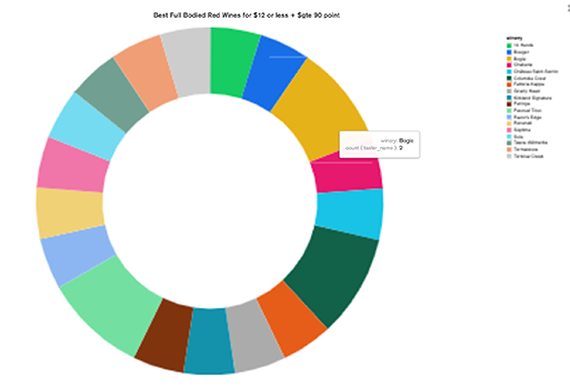
Awesome! This is a handy list to have on hand! I was pleased to see the Bogle brand on the list, as it is a favorite with my husband and I! Pretty cool stuff!
With these new charts saved, I am now able to access them via my new Dashboard:

To import your own data from a Extended JSON, CSV, or TSV export, use the command line tool mongoimport provided by Atlas Cluster UI to upload your data.
NOTE: you will encounter an error if *jsonArray* is not appended to the end of your mongoimport connection string when importing an array of JSON objects, so be sure to include this if your data is arranged in this format.
To learn more about MongoDB Charts, MongoDB has some pretty awesome tutorials that go way more into depth on the subject that I have here:
Cheers and Happy New Year!!


Comments